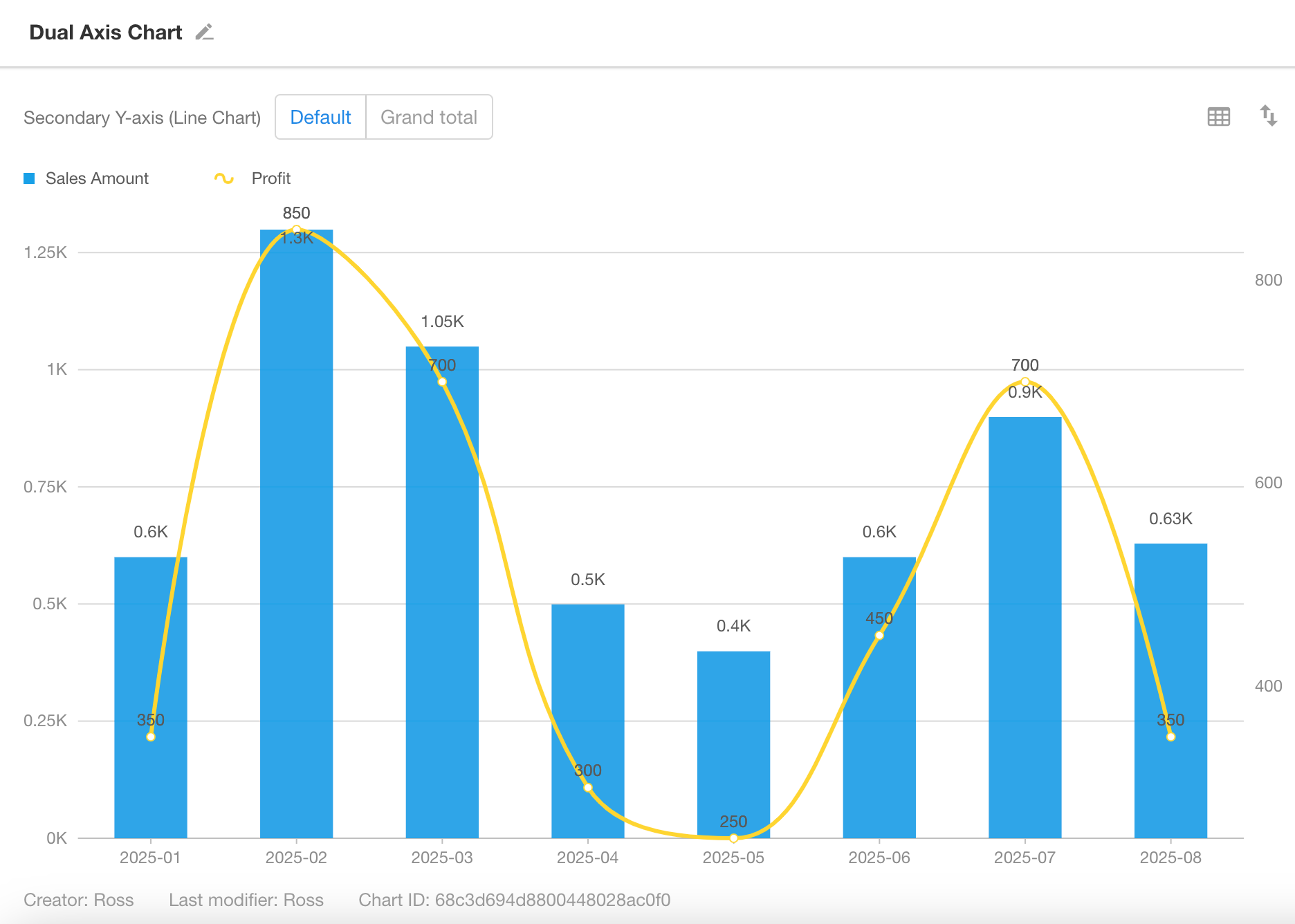
Dual-Axis Chart
A dual-axis chart displays two or more Y-axes on the same chart, typically combining bar and line charts for intuitive comparison. This type of chart is ideal for:
- Comparing two sets of data with significantly different scales
- Showing trends with multiple metrics
- Year-over-year or period-over-period analysis
Below is an example of how to create a dual-axis chart.
Example: Compare Monthly Sales and Profit for the Current Year
-
Data Scope: Filter records in the “Orders” worksheet where the “Signed Date” is within the current year.
-
X-Axis: “Signed Date” field
-
Granularity: Monthly
-
Left Y-Axis: Monthly sales
-
Right Y-Axis: Monthly profit
Chart Configuration
1. Create a New Chart
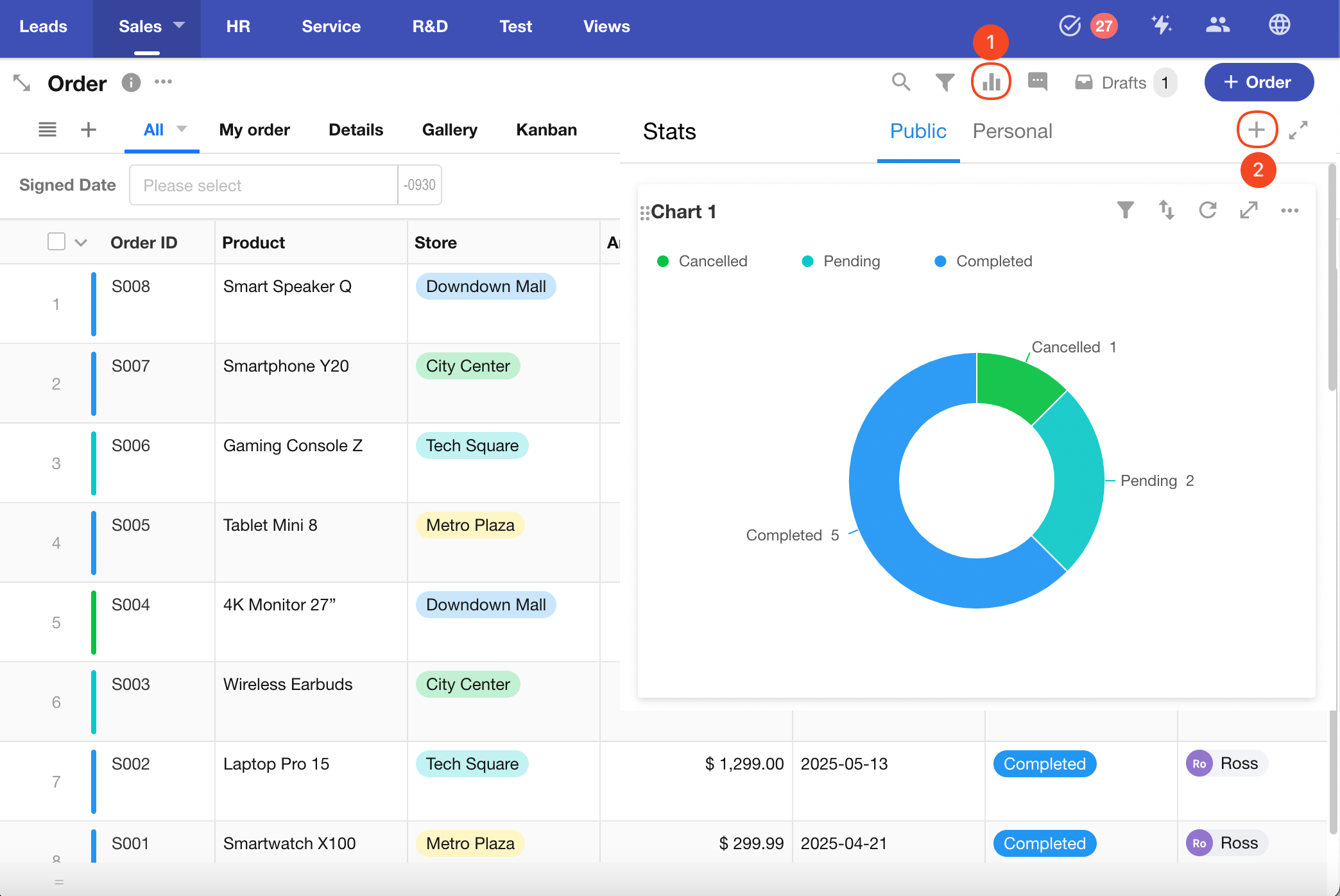
2. Set the Data Scope
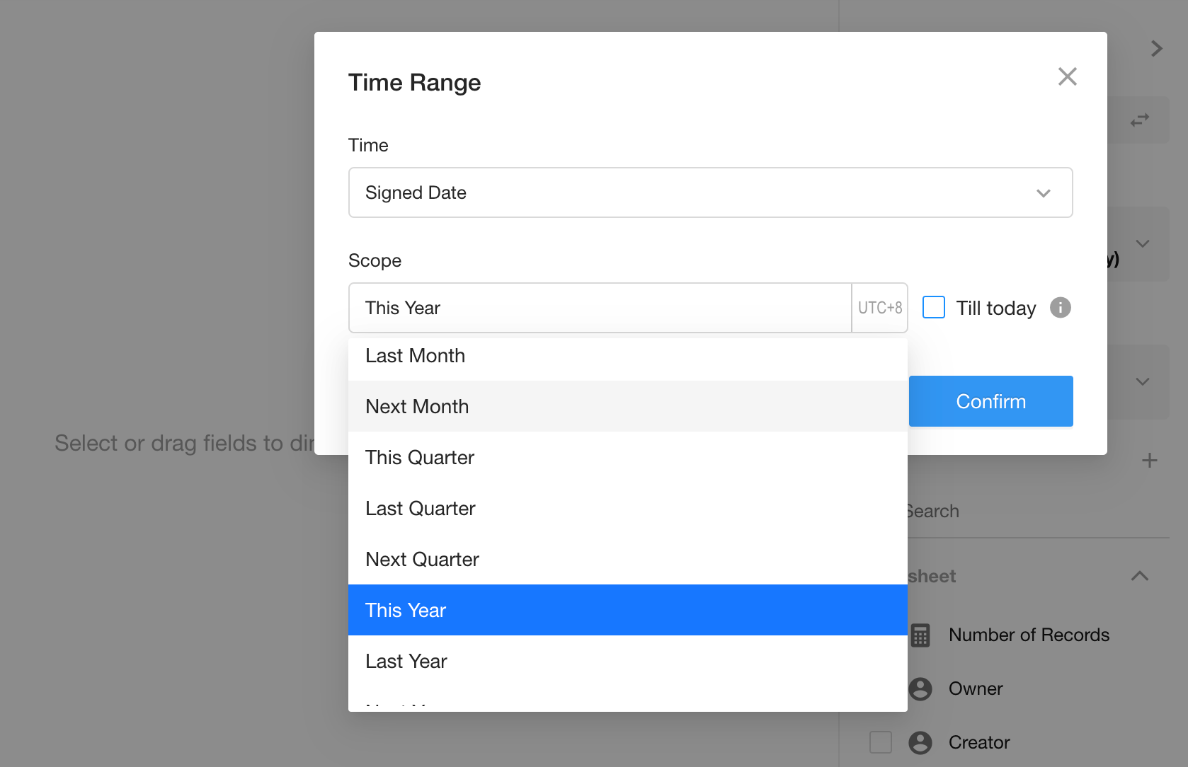
Filter records in the “Orders” worksheet where the “Signed Date” is within the current year.
You can also apply additional filters as needed.
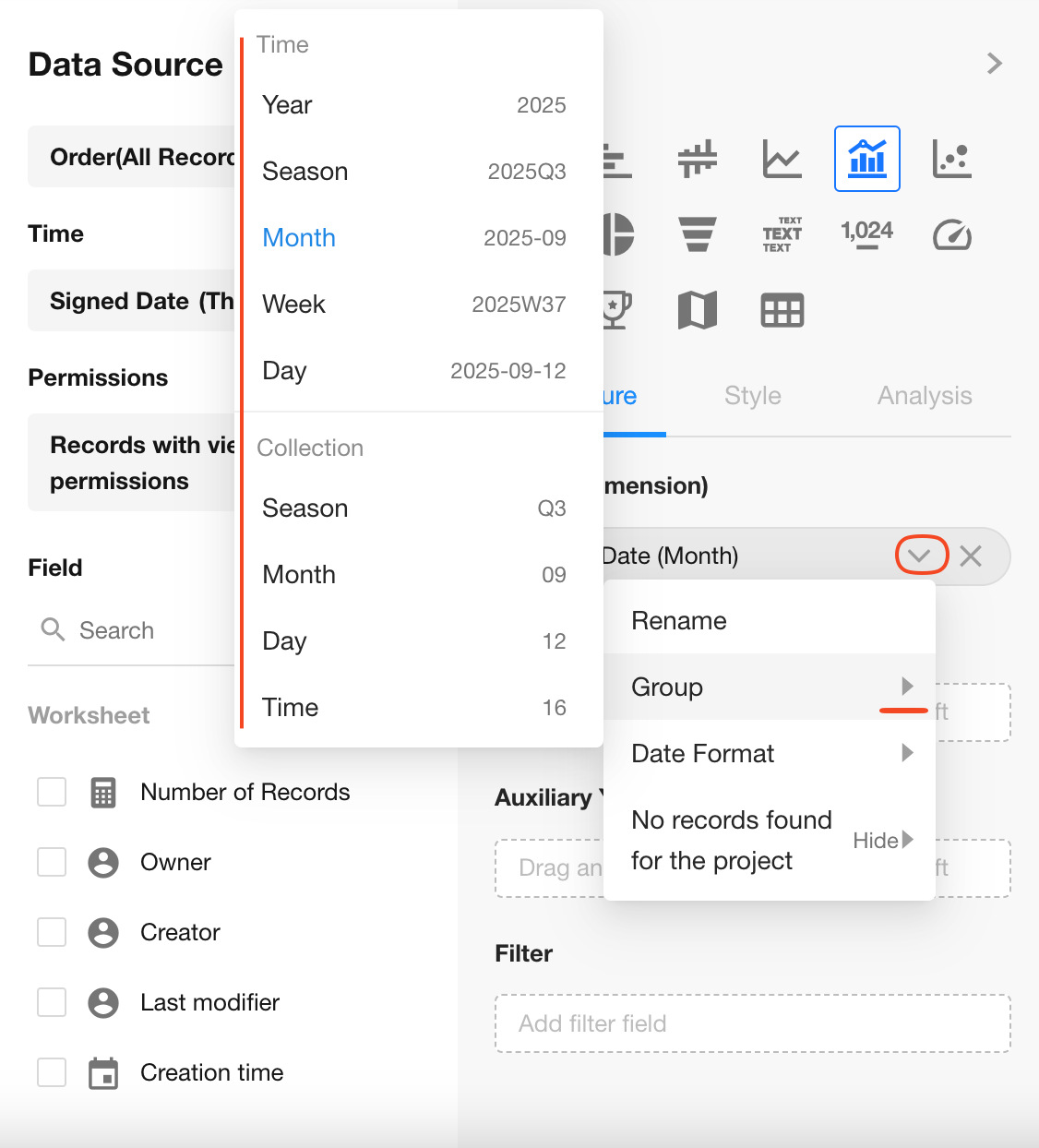
3. Configure the X-Axis
Select the “Signed Date” field, and set granularity to Monthly.
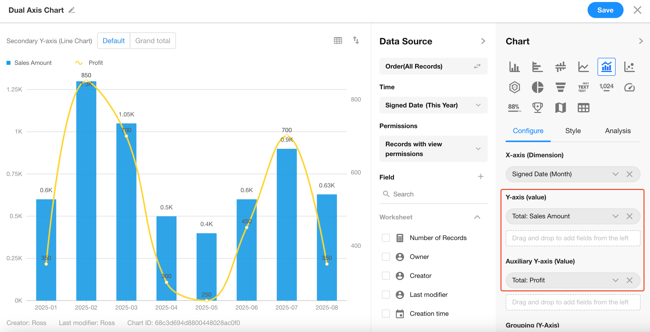
4. Configure Left and Right Y-Axes
Left Y-Axis: Total monthly Sales Amount
Right Y-Axis: Total monthly Profit
Notes on Dual-Axis Behavior
-
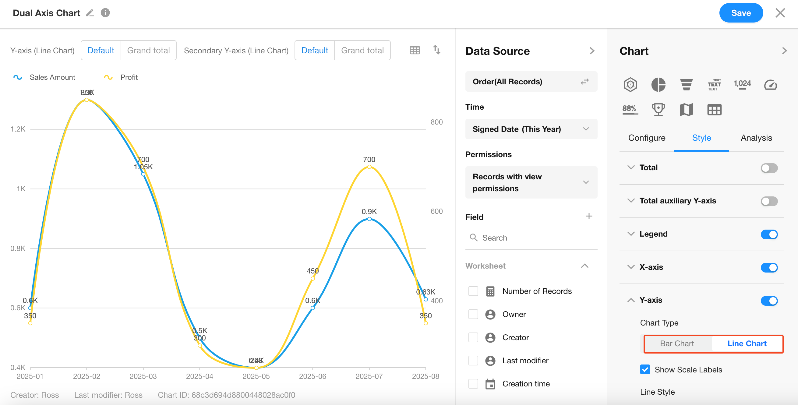
The left Y-axis can be displayed as a bar chart or line chart. The right Y-axis is always a line chart.
-
The X-axis supports only one field, while the Y-axis can support multiple numeric fields or split values from a single field.
-
By default, the left Y-axis uses bar charts, and the right Y-axis uses line charts.
-
When both X-axis and Y-axis are line charts, only one field can be set per Y-axis. Adding a second field will automatically convert the left Y-axis to a bar chart.
5. Save the Chart
Click Save to complete your configuration.
