General Chart Configuration
Although different statistical charts vary in presentation, the creation and configuration process is generally consistent.
This article introduces the common configuration methods for statistical charts. Documentation for each chart type will focus only on its applicable scenarios and specific configuration options.
Chart configuration typically includes the following steps:
Create a chart → Select data range → Choose chart type → Configure dimensions and metrics → Set styles → Save the chart
Creating Charts
1. Create a New Chart
Click the Chart icon in the worksheet to enter the Statistics module, then click “+” to create a new chart.

Public Charts: Visible to all members with access to the worksheet
Personal Charts: Visible only to the chart creator
You can switch between personal and public charts at any time.
We recommend configuring your chart as personal first and switching to public after it’s finalized.
2. Define the Data Range to Analyze
First, determine the specific records you want to analyze.
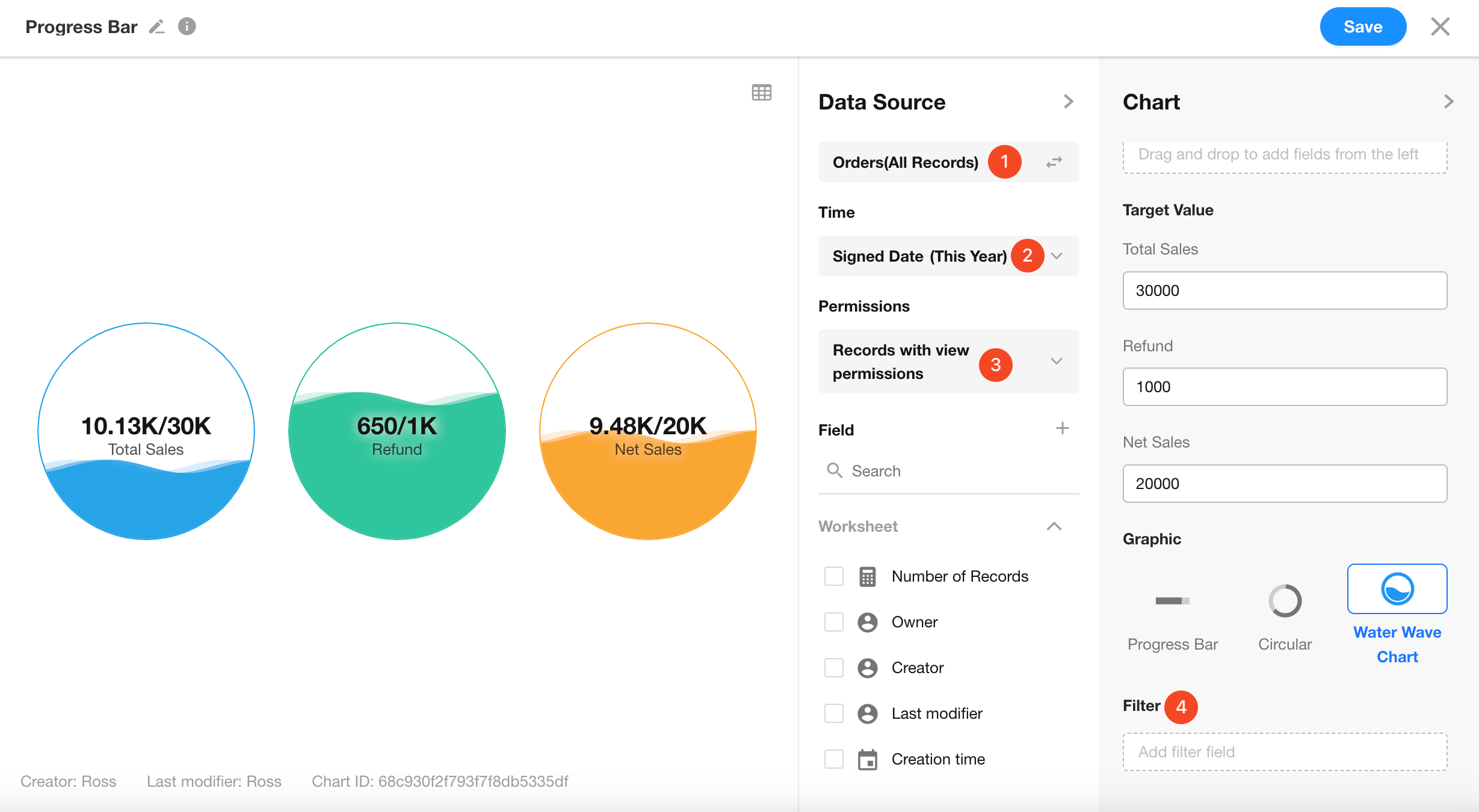
-
Data Source:
By default, all records in the current worksheet are used. You can also choose a specific view. -
Time:
Select a date field (e.g., Creation Time, Modification Time, or any date field), then define a time range:
(Today, Yesterday, This Week, Last Week, This Year, Last Year...) or a custom range.
For example: analyze records created this month. -
Permission:
By default, all records are included. You can also choose to include only the records that the current user has permission to view, based on the permissions configuration. -
Filter:
You can further filter records by dragging fields from the left panel to define filter conditions.
These four settings combined determine the record scope for the chart.
Are There Any Limitations on Record Quantity?
There is no hard limit on the number of records, but there are limits on the number of chart legends (e.g., pie segments, bars, etc.) to ensure chart readability and performance:
- Pie/Word Cloud Charts: Up to 500 items
- Bar/Column/Line Charts: Up to 10,000 items
- Pivot Table: Rows + Columns ≤ 10,000
- Other Chart Types: Up to 5,000 items
When exceeding limits, the system will display a warning such as:
-
Data volume too large. Unable to render chart.
-
Please apply a time filter to reduce dataset.
3. Choose a Suitable Chart Type
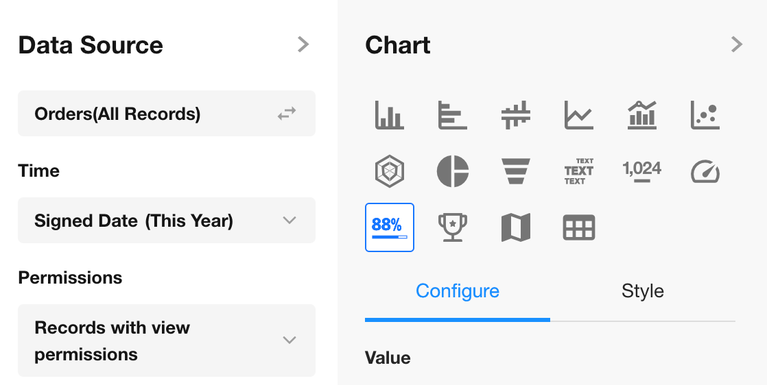
HAP currently supports 16 chart types: Column Chart, Horizontal Bar Chart, Symmetrical Bar Chart, Line Chart, Dual-Axis Chart, Scatter Chart, Radar Chart, Pie Chart, Funnel Chart, Word Cloud, Pivot Table, Number Chart, Dashboard, Progress Bar, Ranking List, Administrative Division.
Each chart type requires different configuration fields.
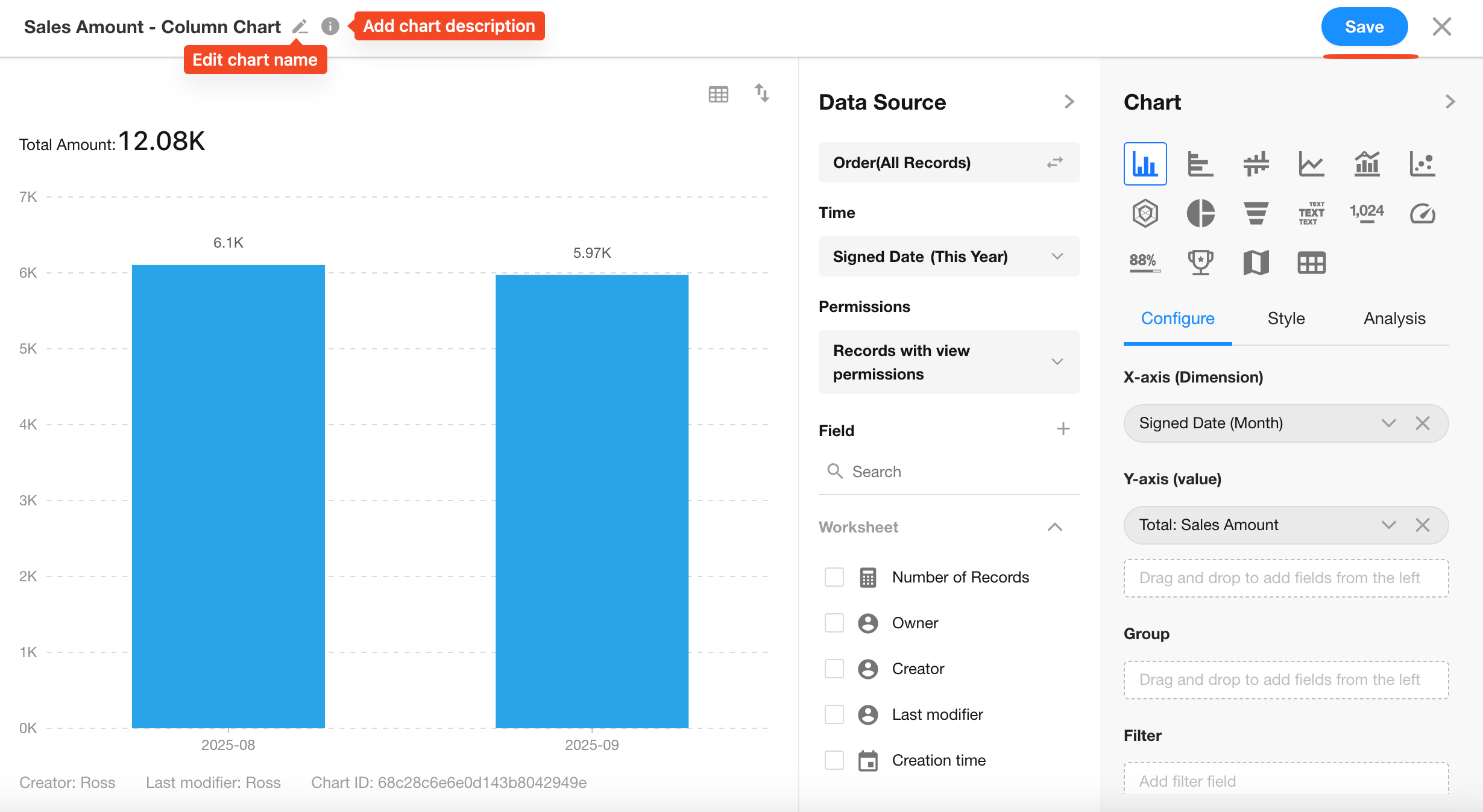
4. Configure Chart Dimensions and Metrics
Using a Column Chart as an Example:
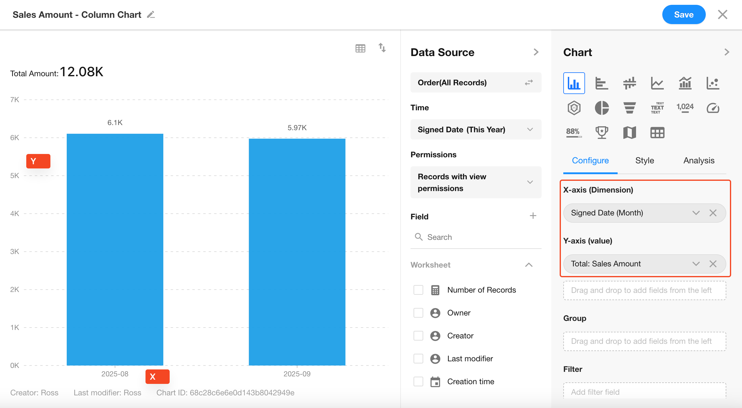
Set the Dimensions:
-
X-Axis:
Represents the dimension (category) used on the horizontal axis. -
Y-Axis:
Represents the metric (value).
For numeric fields, you can choose from Sum, Average, Max, Min.
For non-numeric fields, you can apply Count or Distinct Count. -
Group:
Further splits the X-Axis categories into sub-groups.
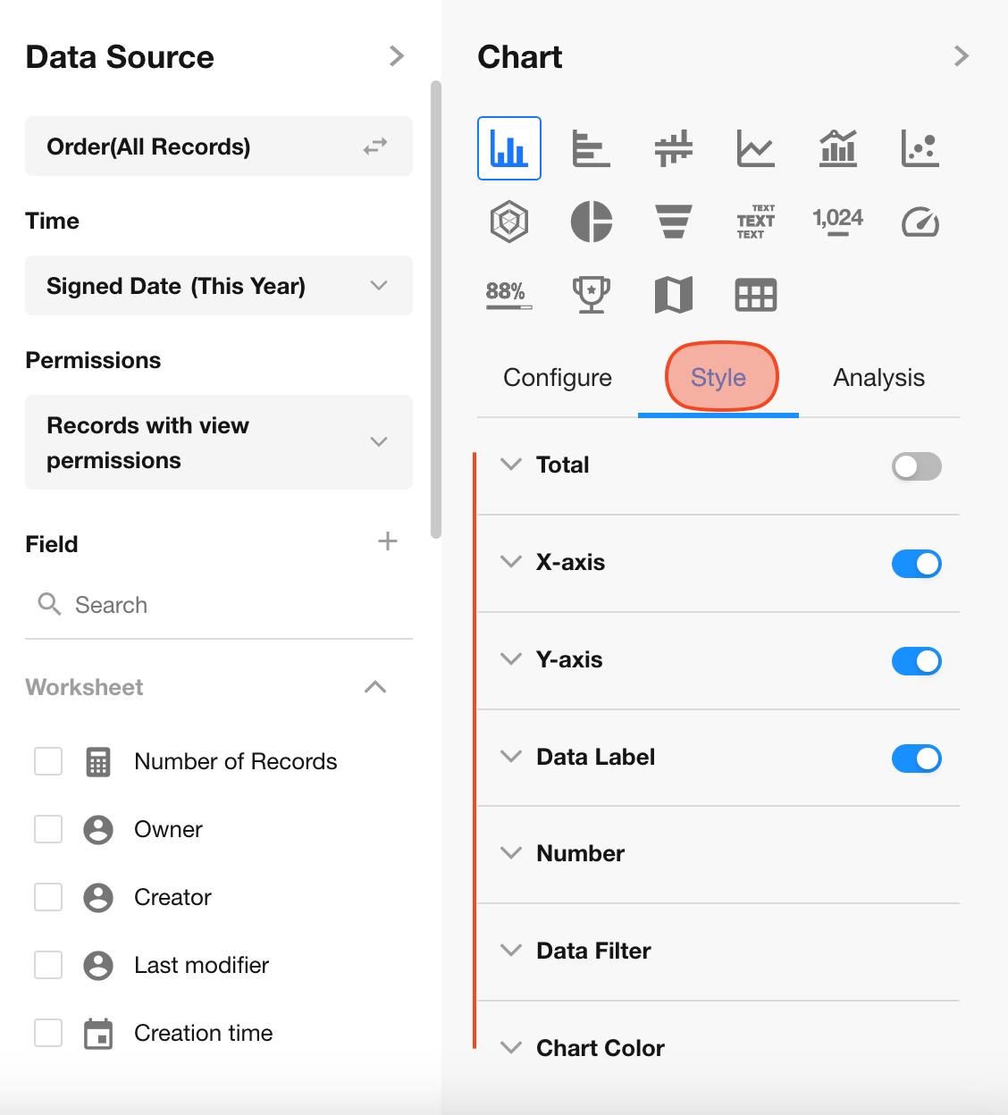
5. Customize Chart Styles
Use toggles to configure additional style and layout options.
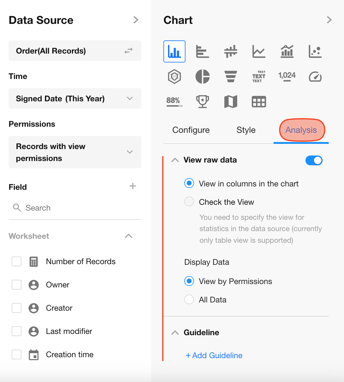
6. Analytical Aids
To assist with analysis, you can view the original data behind the chart or add one or more reference lines for better visual interpretation.
7. Set Chart Name and Description
Click the icon in the top-left corner of the chart to set its name and description. Then click Save to complete the configuration.
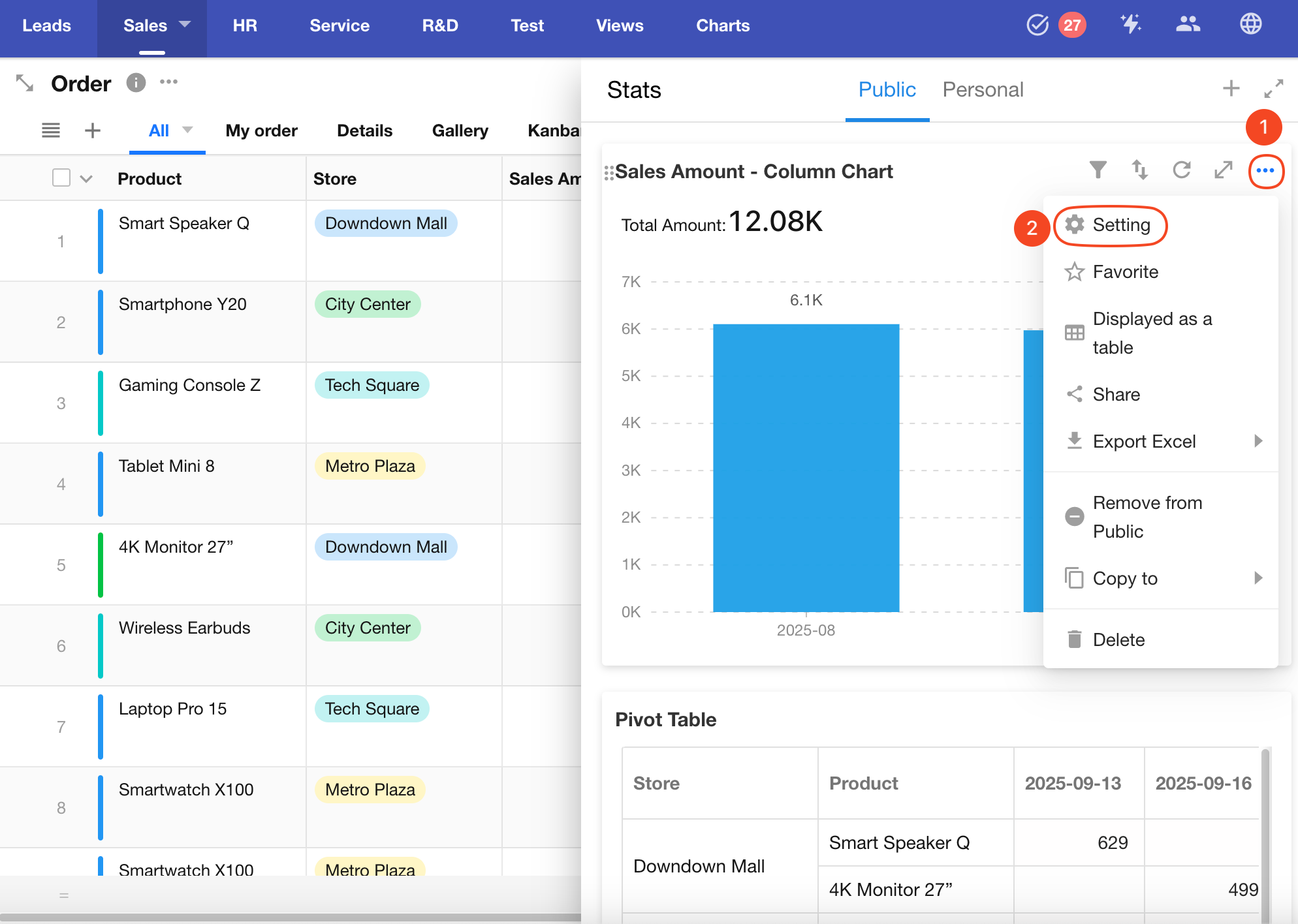
8. Edit Chart Configuration
To modify an existing chart, click the “...” menu, then select Settings to re-enter the configuration panel. The settings interface is identical to the initial chart creation.
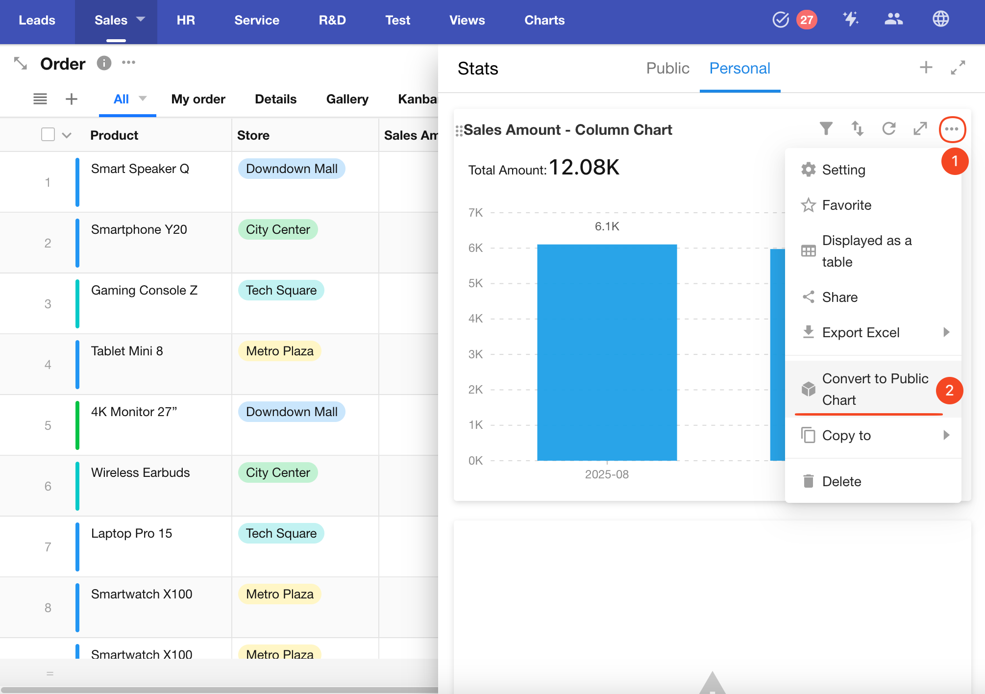
9. Switch Between Personal and Public Charts
-
Converting a public chart to personal makes it visible only to the chart creator (if the operator is not the creator, they will no longer see it).
-
Converting a personal chart to public allows all users with access to the worksheet to view it.
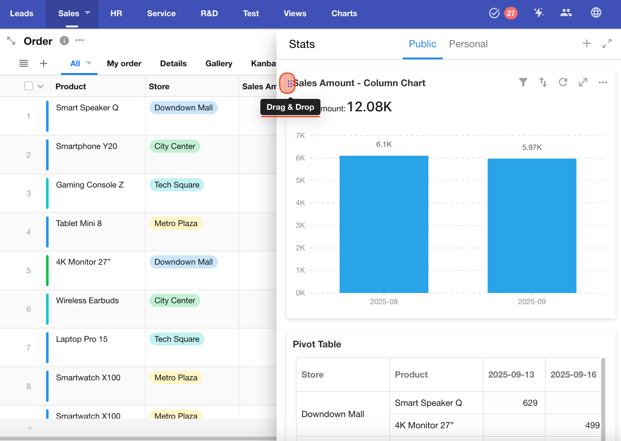
10. Chart Sorting
App administrators can reorder charts. Click and drag the icon in the top-left corner of a chart to adjust its position. The order will be applied for all members.
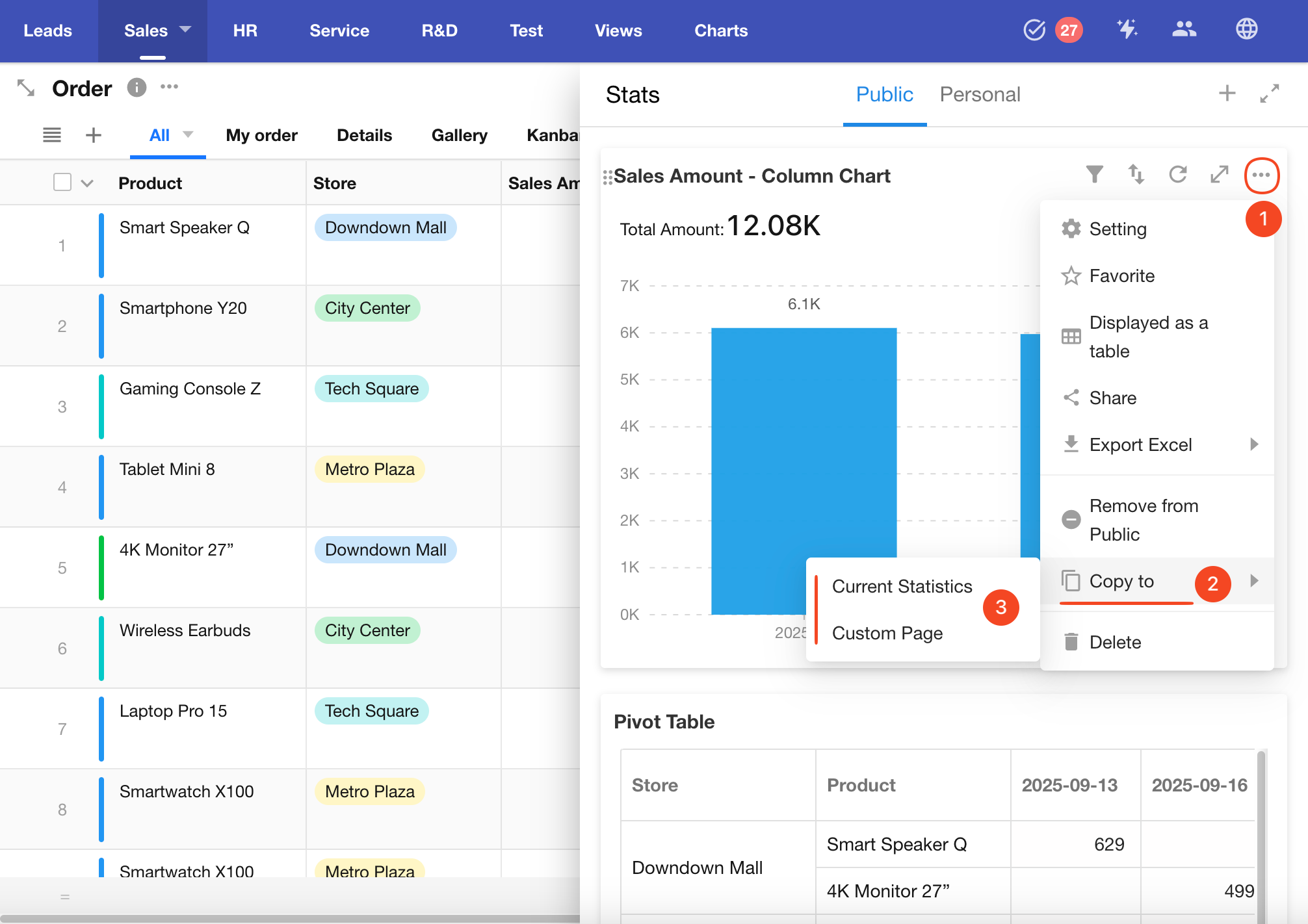
11. Duplicate Chart
App administrators can duplicate an existing chart. The duplicated chart can be saved to:
-
The Statistics module of the current worksheet
-
A Custom Page from any app where you have admin access within your organization
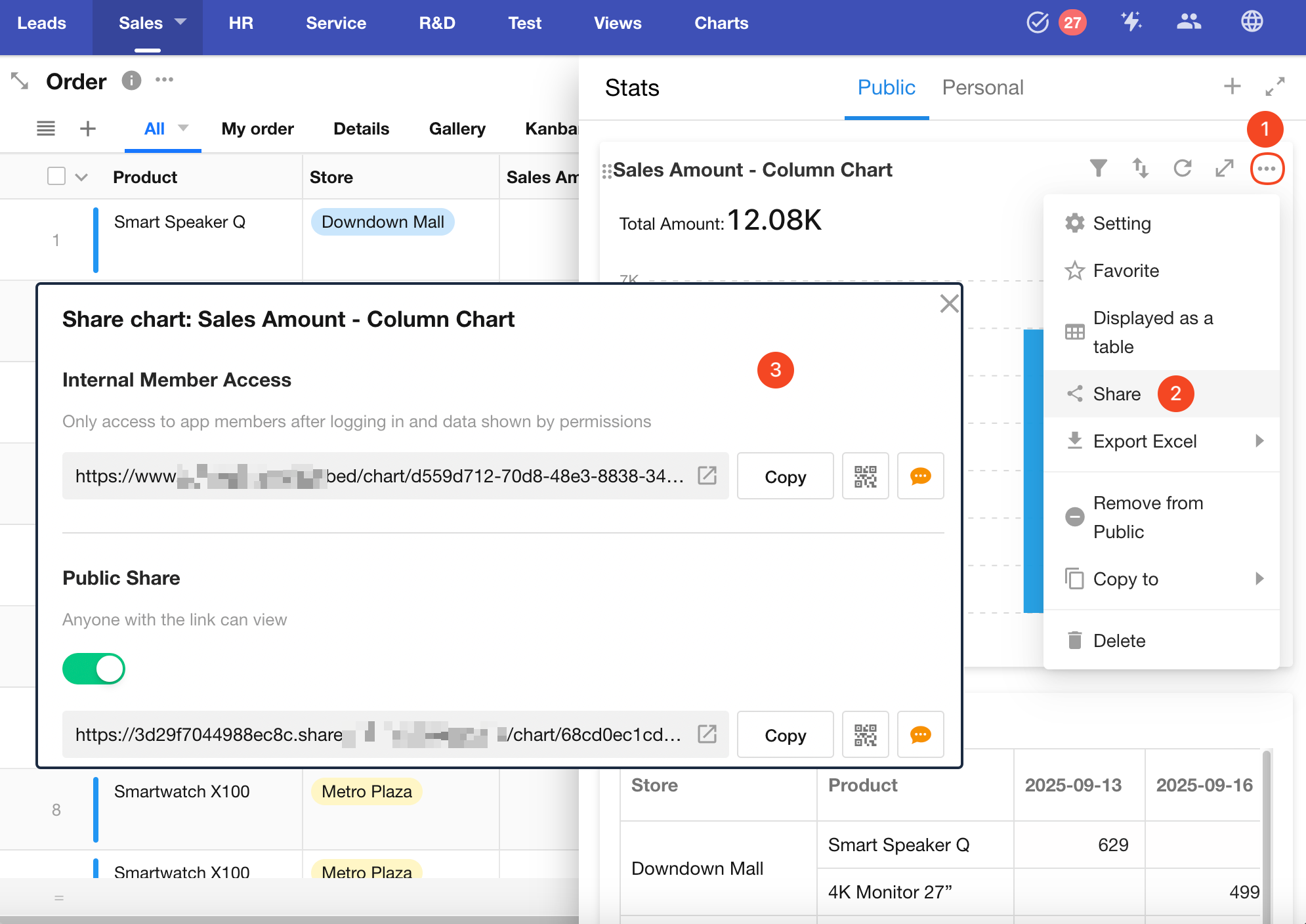
12. Enable Chart Sharing
App administrators can enable chart sharing. Once enabled, other members can generate a public link or QR code to share the chart externally.
User Operations on Charts
End users can perform various custom operations when viewing charts, including additional filtering, sorting, exporting, saving as images, and external sharing.
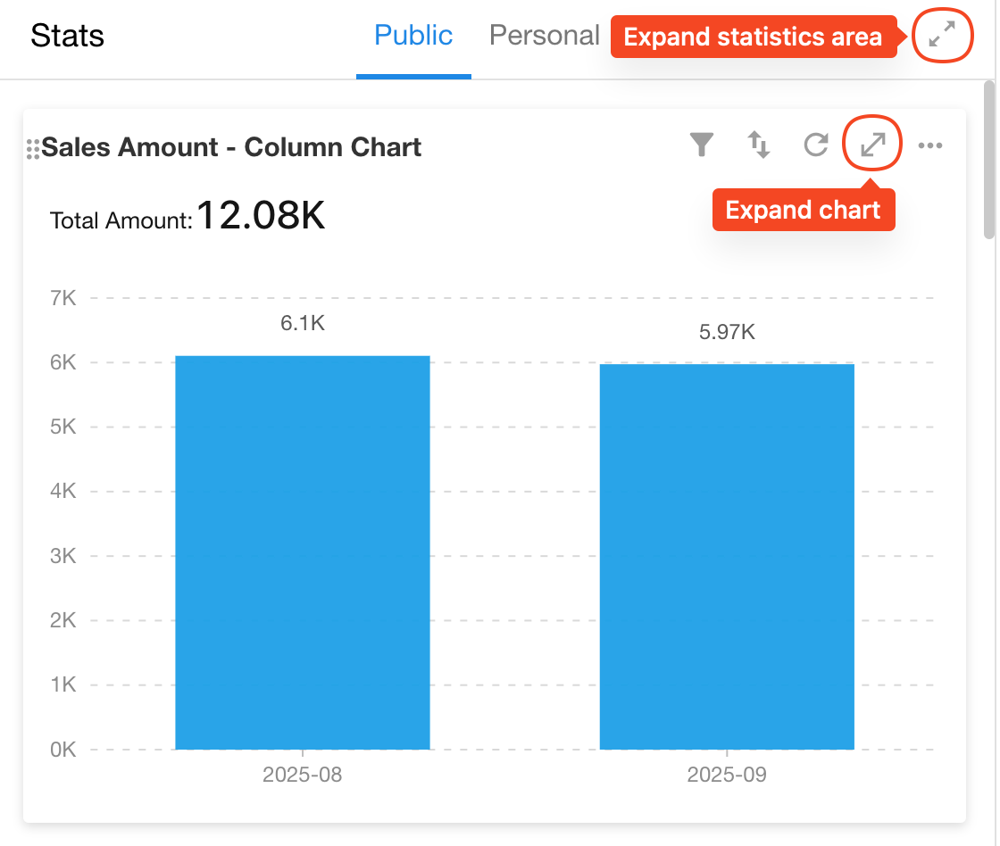
1. Expand Chart Area
2. Filter and Sort
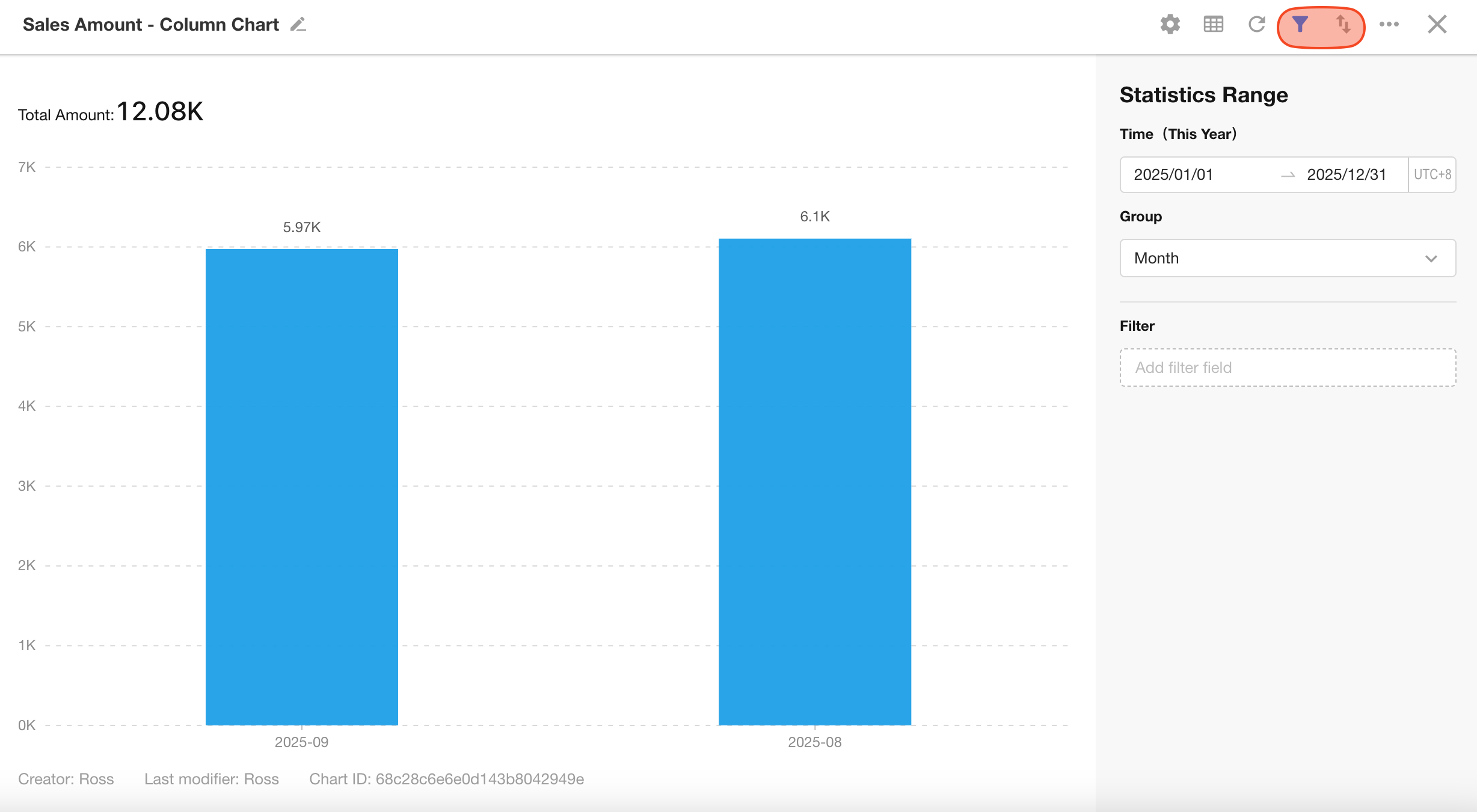
Filtering:
Users can apply additional filters based on the configured chart. The filtered data will not exceed the scope defined by the chart settings.
Sorting:
Only supports sorting by a single dimension.
3. Share Charts
Charts can be shared externally via link or QR code. Recipients can view the chart without logging in.
-
Sharing is disabled by default.
-
Only app administrators can enable sharing. Once enabled, other users can share the chart externally.

4. Export Charts
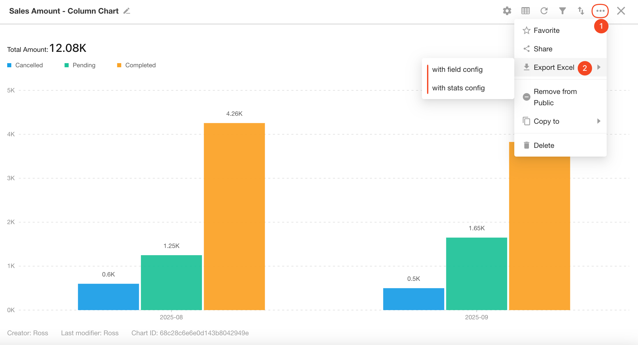
Chart dada can be exported in Excel format. The exported file will use the chart's name as the file name. You can choose to export:
- Raw data
- Data with unit formatting
- Pivot Tables will be exported based on their layout.
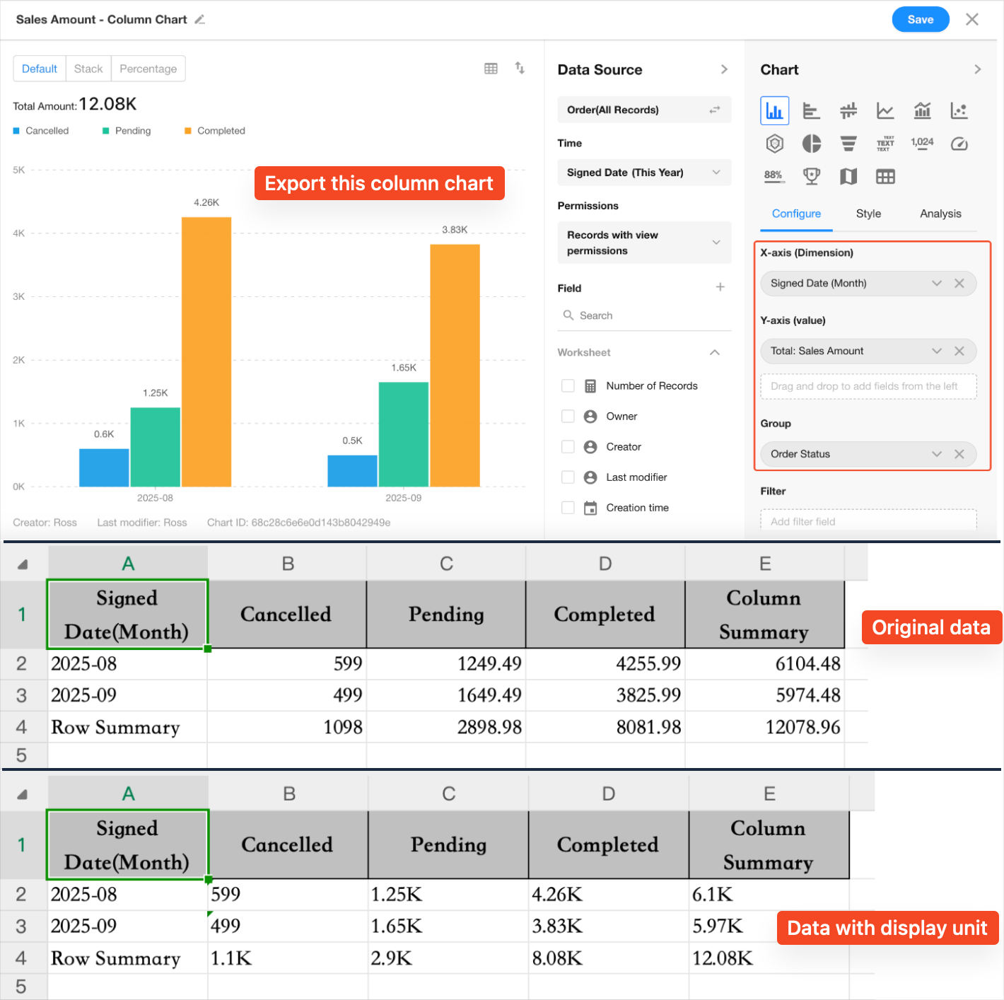
- Other chart types will export data values (not visual charts).
- Each row in Excel corresponds to an X-Y data pair.
Example: Exporting a column chart
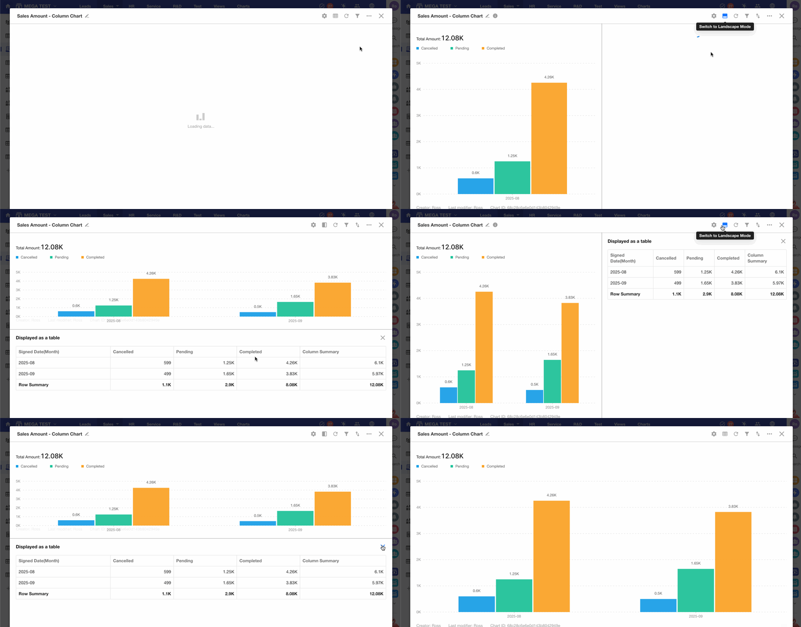
5. View Chart Data as Table
Click the table icon in the top-right corner to show the chart data source in a tabular layout beside the chart.
Supports both vertical and horizontal views.
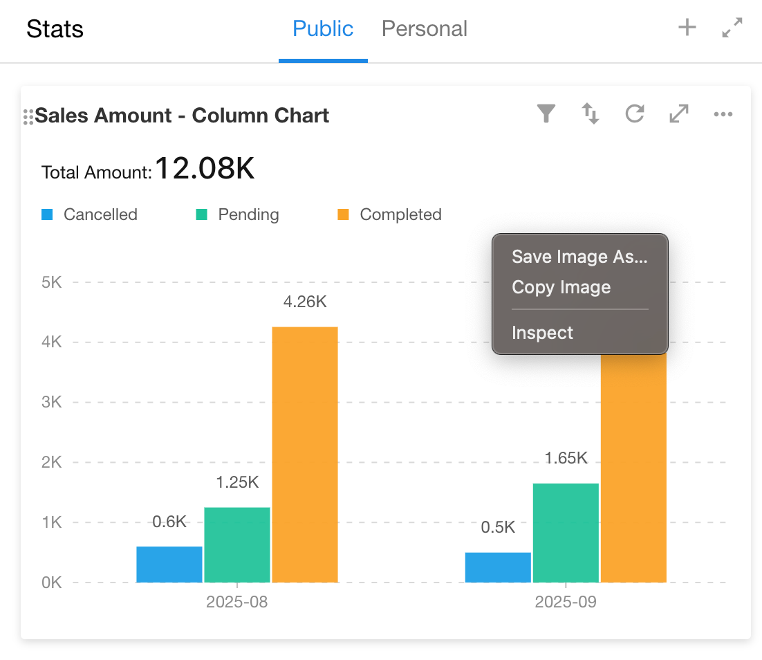
6. Save Chart as Image
Bar charts, line charts, and similar chart types can be saved as image files.
7. Adjust Column Width
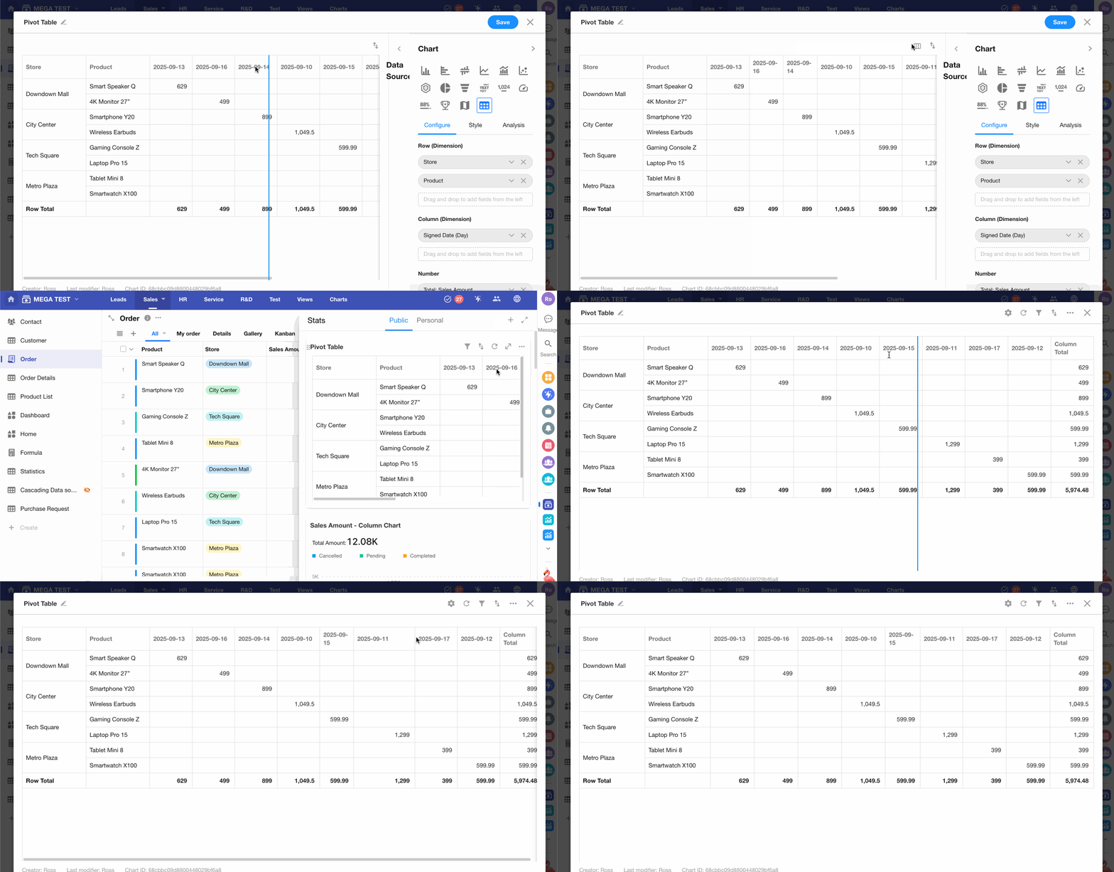
For pivot tables, columns can be resized manually or set to evenly distributed widths.
