Scatter Chart
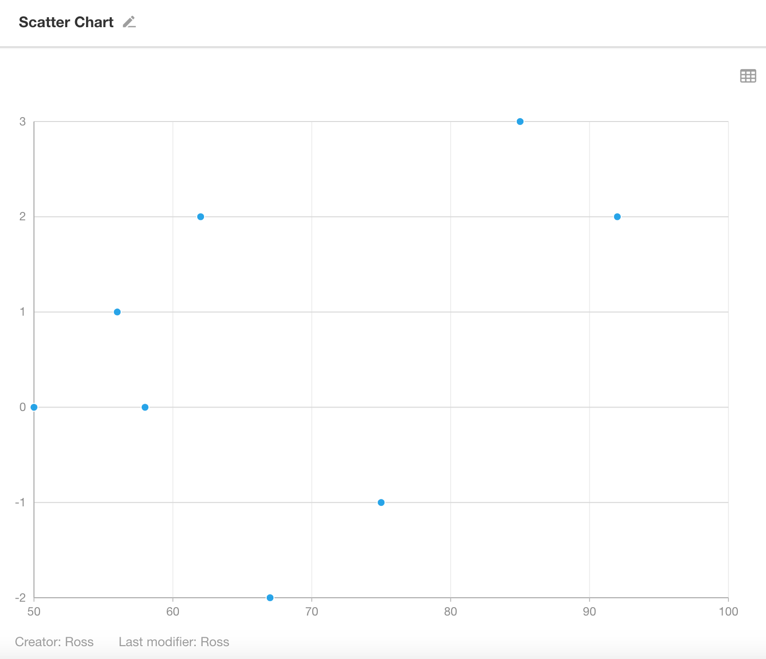
A scatter chart displays data points plotted on the chart using X and Y values. It shows the overall trend of how a dependent variable (Y-axis) changes with respect to an independent variable (X-axis). It also helps to visualize the data distribution across dimensions and color groups.
Below is an example of how to create a scatter chart.
Example: Track Weight Trends for Fitness Users
Data Scope: Filter records in the Fitness Management worksheet where the “Date” is within the current month
Point Dimension: "Target Weight"
X-Axis: "Daily Weight"
Y-Axis: "Diffrence", weight deviation from goal"
Chart Configuration
1. Create a New Chart
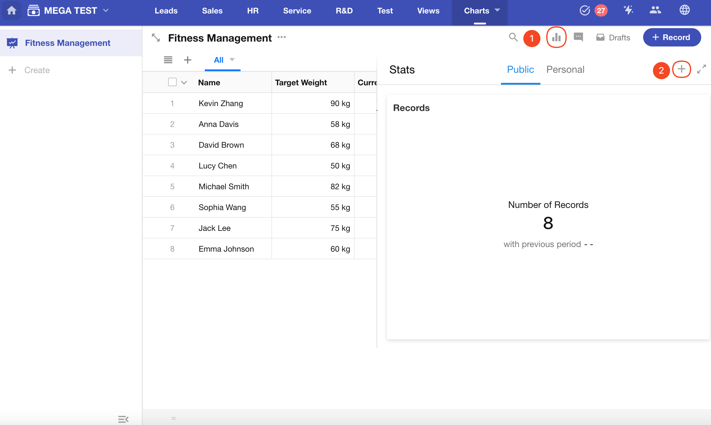
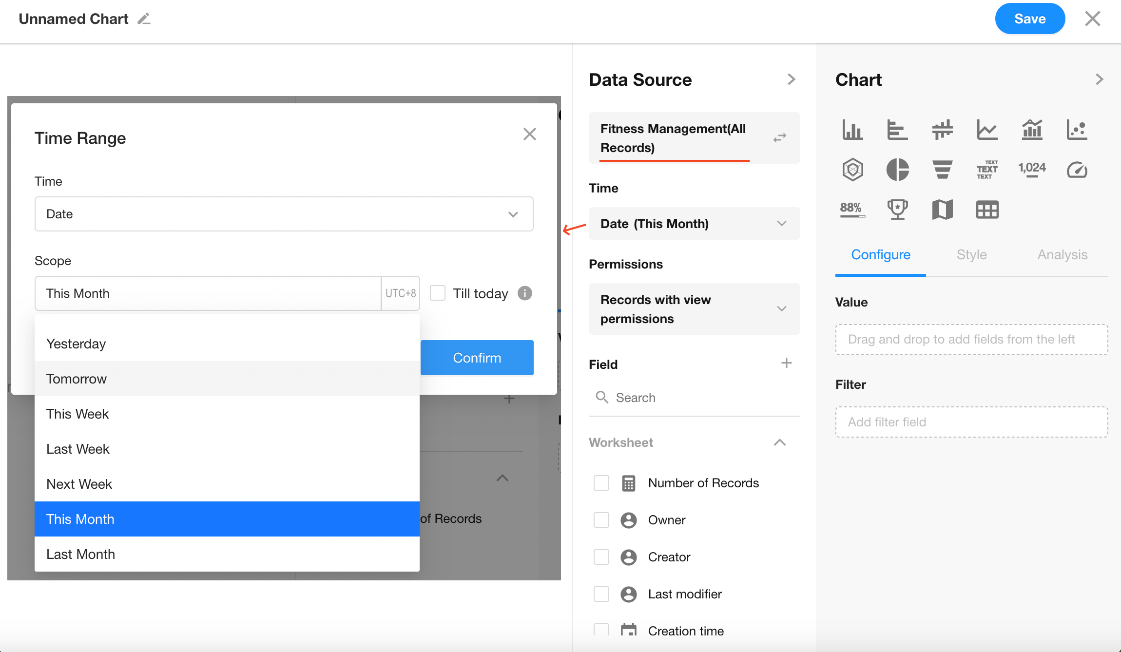
2. Set the Data Scope
Filter records in the “Fitness Management” worksheet where the “Date” is within the current month.
3. Select the Chart Type: Scatter Chart
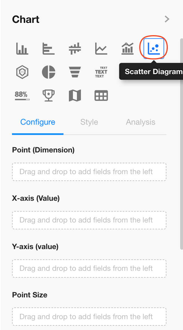
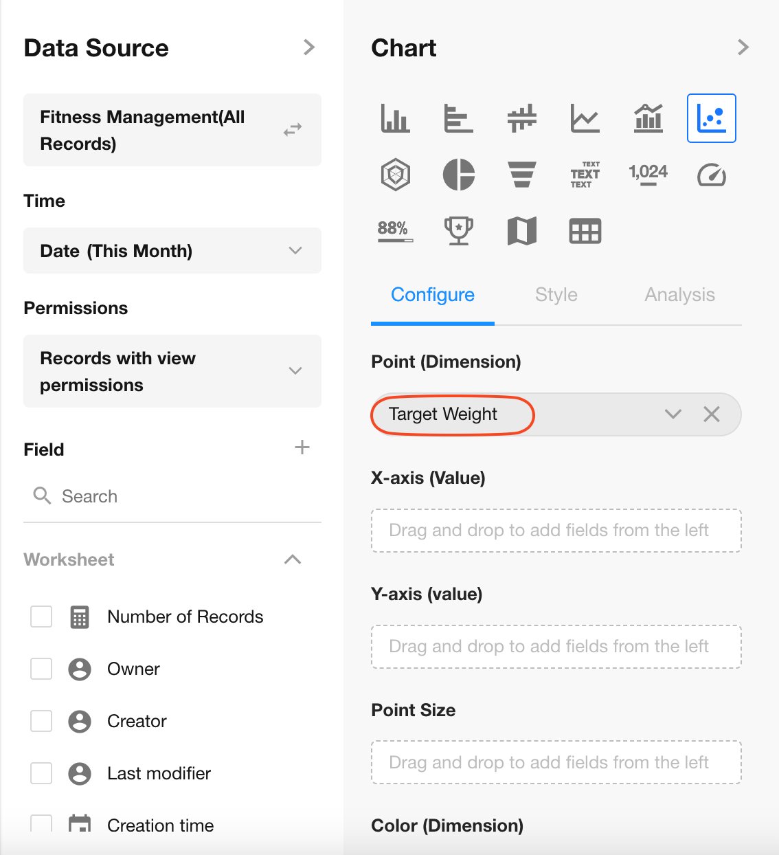
4. Set the Point Dimension
Select the "Target Weight" field.
Note: The maximum number of data points allowed is 1,000.
5. Configure X and Y Axes
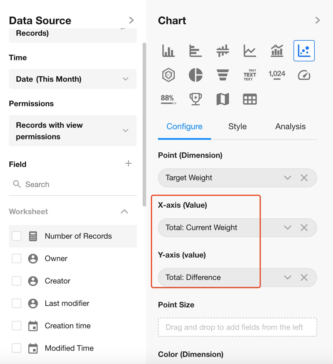
Set the statistical fields:
- X-Axis: "Daily Weight"
- Y-Axis: "Diffrence"
6. Point Size
The point size is determined by a numeric field. It can be the same as the X or Y field.
7. Color (Dimension/Value)
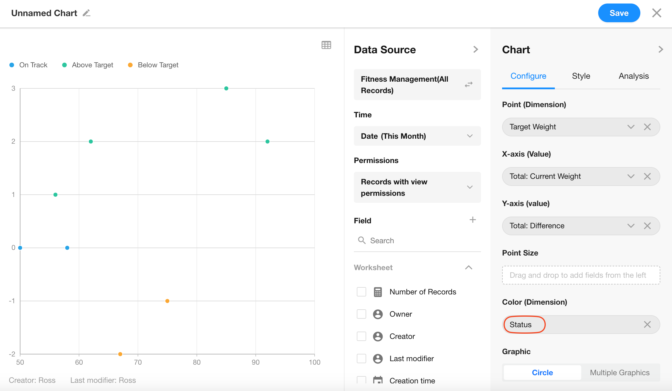
You can choose an option-type field to apply color to data points.
Click Save to finish chart configuration.
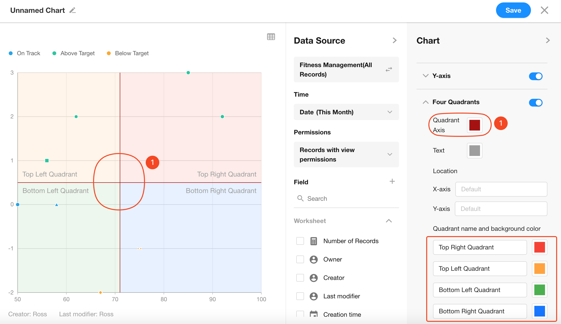
8. Quadrants
You can optionally configure quadrant lines, including custom colors and labels for each quadrant.
